
via Facebook https://www.facebook.com/photo.php?fbid=10152011747261807&set=a.10150804218396807.479308.657281806&type=1


Everyone seems to love Pinterest. By everyone, I’m not talking about every person. It’s the brands, the marketing companies, and the entertainment people that find Pinterest so appealing. As far as people, women still dominate the site but men are finding their place on the picture-sharing social network as well.
In this infographic from ShareThis, we look at the various components of Pinterest that are continuously growing. Just when you thought that it might be hitting a plateau, it busts out with more amazing numbers. Click to enlarge.


The post Moms Still Rule Pinterest but it’s Growing for Dads as Well appeared first on Soshable | Social Media Blog.


All interpretations of men when trying to dramatize the Bible fall short. Some of the attempts are strong, but there’s no replacement for reading the Bible. However, for some, visualizations are the best way to reach them.
This particular interpretation is, of course, flawed. However, it is exceptionally dramatic and stays relatively close to the actual scripture. For this reason, it may be a good one to watch, especially to introduce someone new to the Word of God in hopes that they will then pick up their Bible and read further.
The post Movie About the Gospel of John is Quite Good appeared first on Judeo Christian Church.
When you want to get some pretty good data on using social media for marketing, one of the best people to turn to is Dan Zarrella, Hubspot’s social media scientist. “Mad scientist” may be a better phrase for him, but he’s crazy like a fox when it comes to Twitter.
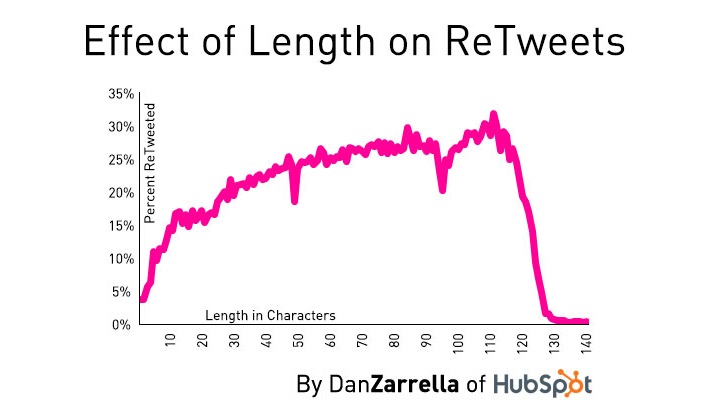
This latest round of insights comes in the form of how to get retweets. Size is important as can be seen in the graph above. What’s the right size? 100-115 characters appears to be the sweet spot. This can be attributed to a few things. First, longer Tweets can be retweeted the standard way, but when they’re manually retweeted (such as “RT @0boy…) then the longer Tweets can’t work as well. More importantly, people know that they will not be as easily able to be retweeted themselves if the Tweet is too long.
Another reason for this is quality of content. With the limited space in Twitter, it’s hard to say things that are profound, funny, or generally retweet-worthy until you get into the longer format.
Lastly, tweets of this range seem to look better. They may or may not include a link. Whether they do or do not, they appear very nicely in Twitter apps and in the stream in a way that is psychologically appealing. It may sound simplistic, but shorter tweets seem too short and longer tweets turn people off for the reason given above.
At any rate, this data is compiled from a data set of 1.4 million randomly selected Tweets. It’s as comprehensive as they come. One thing that should be noted: the length of the Tweet is infinitely less important than the engagement of the account itself. If nobody’s listening to you, no measure of science is going to get you more retweets.


There was a huge uproar in the search marketing and website design industry last year when Google came out and recommended responsive web design. While Google has been known to make recommendations in the past, they’ve never tackled this particular issue definitively until June, 2012. Since then, many companies have been scrambling to convert to a responsive design.
They reiterated the need for a mobile solution earlier this year when they said that they would soon stop showing web pages that improperly redirected to a different page when called up on mobile devices. The two pieces of news were combined because of a logical series of assumptions:
Everything is fine until you come to the conclusion. From a search perspective, properly coded adaptive websites with identical intents on all devices combined with proper transfer of HTML content are just as easy to rank well on Google as responsive website design.
As I researched this, I found one things that was disturbing and that needs to be addressed. The opinions most commonly expressed by companies weighing in on the debate between between responsive website design versus adaptive website design always ran parallel with the offerings of the company posting the opinion. If they offered responsive design, they said that responsive design was the only way to go. If they offered adaptive websites, they said that adaptive was the best way to go.
The unbiased publications that I read almost all came to the same conclusion – functionality of the site was much more important than the type of design used. In other words, if responsive design made it challenging for a website to function properly on mobile devices, then adaptive websites were recommended. If the flow was fine between devices and the path to turning to responsive design was an easy one, then that was the way to go.
I’m going to start with the “bias” on my end and finish this paragraph with the punchline. The bias is this: my company is developing responsive website design for our clients. The punchline is this: even with this knowledge, I still recommend adaptive for any website (including my clients’ websites) that are picture- and call-to-action-heavy on important pages such as inventory.
I have yet to see a responsive car dealer website that did not sacrifice functionality and speed for the sake of responsive design. I’ve seen both sides of the spectrum – websites that looked great and worked fine on mobile devices but that were bare-bones in their PC functionality and I’ve seen websites that looked great on a PC but that were too slow and rendered improperly on many mobile devices. I haven’t seen any that have done it “right” yet because of the nature of car dealer websites.
Most importantly, I’ve seen dealer websites that switched from adaptive to responsive that watched their website leads drop as a result. I have yet to see a single one that saw leads increase. This will change as responsive technology, internet speeds, third party plugins, and image crunching (especially for dealers that load up 30+ images on their vehicle detail pages) improves, but as of now responsive has been a huge flop.
I should also note that I jumped on the responsive bandwagon back in 2011 and strongly pushed for my company to adopt it way back then. Thankfully, we didn’t.
I should also note that for the majority of websites, responsive is likely the best solution. Car dealers have unique website formats. On any given page, especially the all-important vehicle details pages, there may be three or four plugins, a dozen calls-to-action, and dozens of photos that have to be brought in through 3G or 4G connections. The biggest difference between adaptive website design and responsive website design is when the changes are made to adjust for the device. On adaptive websites, the changes are server side, meaning that the data being sent is determined from the server before being sent to the device. With responsive design, the changes are client side, meaning that the whole web page is sent through and then the device is told how to piece it all together.
Here’s a very slanted infographic, one that actually does have some valid points (thankfully). Whoever built it likes adaptive and while they are being too harsh in my opinion about responsive, they still bring up some real challenges.


The post Understanding the Differences Between Adaptive and Responsive Website Design appeared first on Soshable | Social Media Blog.

For God sent not his Son into the world to condemn the world; but that the world through him might be saved.
Everyone is very familiar with John 3:16, Christians and non-Christians alike. It’s the most commonly used verse, one that children are first taught in Sunday school.
The verse that follows it is much more telling in my humble opinion. It’s not that the message is more important. It’s that it needs to be known just as much as the one preceding it because it puts into perspective the importance of Jesus Christ as the one true Lord and Savior for those willing to believe in Him.
The post John 3:17 – the world through Him might be saved appeared first on Judeo Christian Church.


